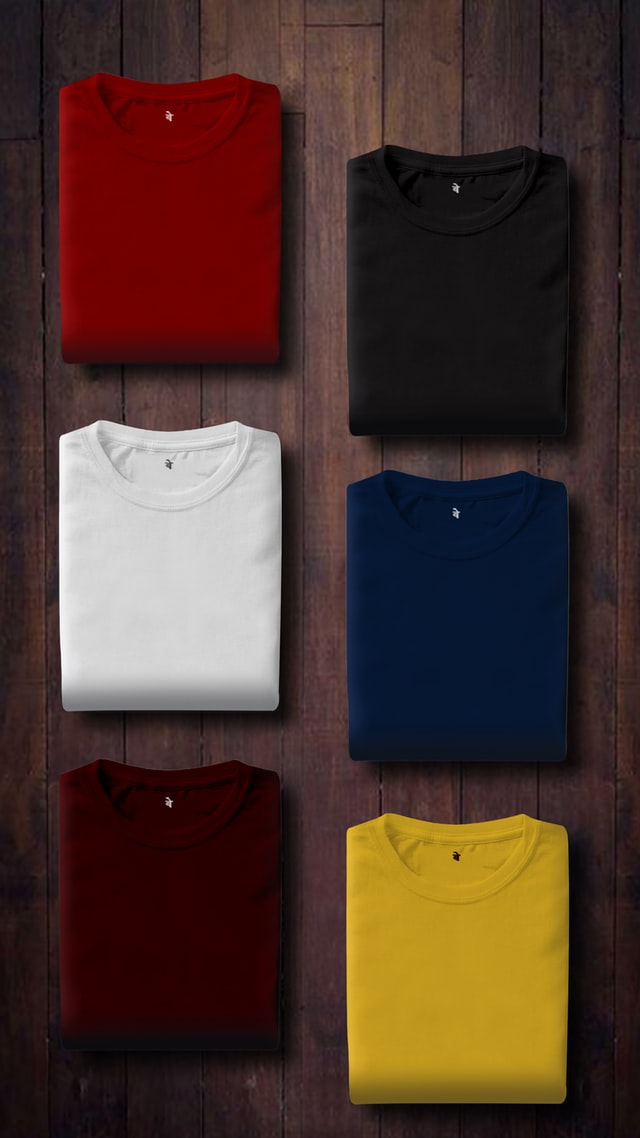
Promotional products for your Denver business need to be visual representations of your brand. Graphics and font can quickly become priorities in the design process as crucial visual elements to promote your company. However, you should also be focusing on the color of your promotional products.
Color is a powerful visual tool you can use to evoke specific emotions in consumers. Believe it or not, color affects how you feel. You can harness the emotional value of color to create eye-popping promotional products.
Read on to learn how to make your brand’s products stand out with strategic color choice. Screen-printed T-shirts, totes, hats, and other products will be heightened with the best possible colors.
The Power of Color
When we see color, it affects how we feel. Color is a universal communicator, denoting everything from tranquility to passion and everything in between. The mood-altering effects of color have been used in fashion, interior design, and, of course, advertising.
Warm and Cool Colors
On a broad scale, we can consider the warm and cool colors on the color spectrum. Warm colors include red, yellow, orange, and other variations on these colors. Cool colors include blue, purple, green, and variations.
Warm colors may be associated with emotions from warmth to anger. Red, yellow, and orange are all thought to boost energy levels and stimulate the body. Cool colors are typically considered to have a calming, healing effect on the body, though certain shades may evoke feelings of sadness or melancholy.
Color Impacts Marketing
Given that colors are associated with emotions, they’re powerful tools in all types of marketing. When it comes to promotional products, you have a fantastic opportunity to showcase colors that will strengthen the “feel” of your Denver brand. How do you want people to feel when they see your logo, or use your product? Use that feeling to guide the creation of promotional products that bolster your marketing campaign.
Selecting a Color For Your Promotional Product
Now that we’ve established the influence that color can have on your marketing strategies, let’s learn how to select the best colors for your promotional products. In the case of a promotion for your company, you likely want to evoke positive emotions in your current and future customers. To get the right feeling, you’ll need to consider your target audience. What are their preferences? How should they feel towards your brand?
On a basic level, demographics can guide your color selections. For instance, people of different ages are likely to want differently colored T-shirts. Brighter shades tend to be more attractive to children, while adults will look for practicality in their apparel.
The colors that you select should also make a statement about your brand and what you stand for. For instance:
- Green can be associated with nature and environmentally-conscious products
- Blue can be associated with a brand that sells healing, therapeutic products, and well as a general sense of professionalism and trust. For this reason, banks often select blue for their logos and promotional products.
- Yellow can be associated with recreation and outdoor activities
- Deep shades of red (such as maroon) and purple have an elegant, sophisticated appearance for brands seeking aesthetic appeal with an older audience
Consider The Type of Product
Are you selecting a color for a T-shirt? A tote bag? A mug? The type of promotional product should play a role in the color selection process. A promotional product that a person will wear, such as a T-shirt or hat, will need to be a flattering color so that it can be worn comfortably. But, promotional desk supplies, for example, should be colored in order to stand out from other office supplies.
Color Combinations
Your promotional product may likely feature more than one color. In this case, it’s important to select colors that complement each other. In the case of a background color and a font color, for instance, the font color should be clearly visible against the background. If the background is dark, the font should be white or a pale color. If the font is dark, the background should be a light color.
In the case of T-shirt screen printing in Denver, try to avoid using multiple bold colors in a single design. Instead, choose one stand-out color and select hues that will complement it – not detract from it.
With thoughtful color choices, your promotional products will positively portray your brand.

